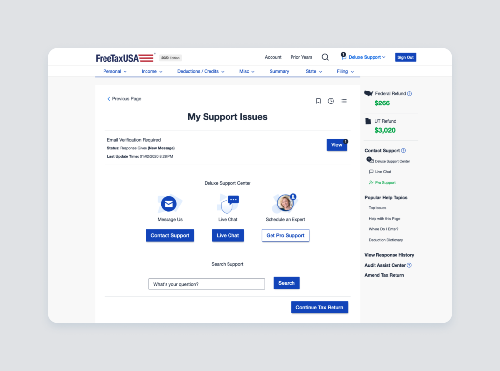
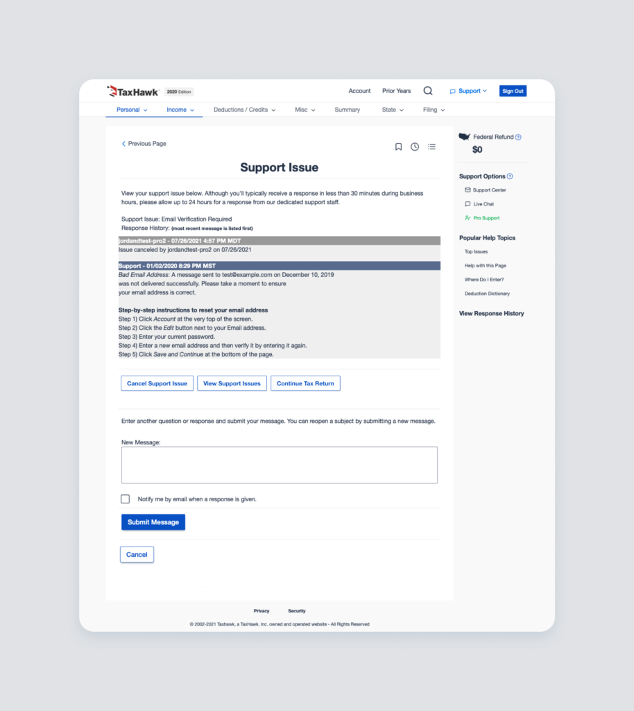
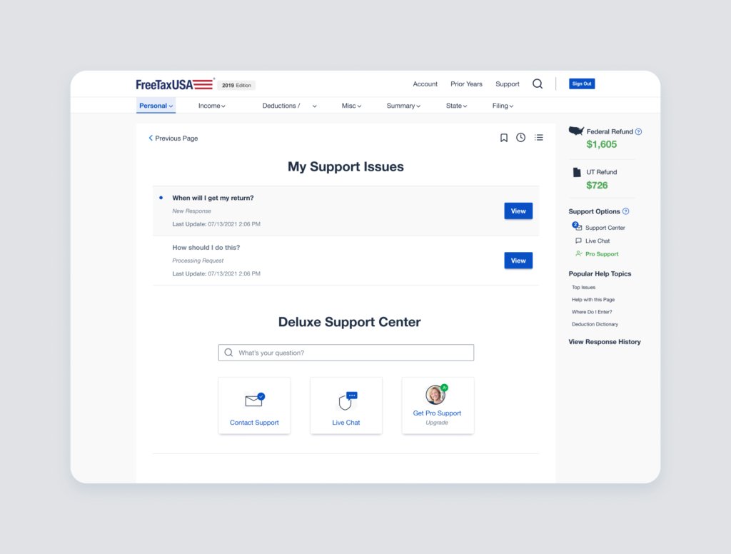
FreeTaxUSA’s support center is where people navigate when they want technical or professional help filing their taxes. Through this support center, they can message support agents and tax experts. It’s also a key page where people upgrade to the deluxe or pro options, which is how TaxHawk makes money. I improved the usability of the support center by updating the look and feel as well as clarifying and communicating the different support options.
Client
TaxHawk is the parent company of FreeTaxUSA, the third biggest tax-filing website in the U.S. (after TurboTax and H&R Block). Though FreeTaxUSA is known as the “value choice” on the market, it strives to make tax-filing as painless as possible and accommodates all tax situations, no matter how complex.
Problem
FreeTaxUSA’s support center was really outdated and the layout was confusing. Users couldn’t effectively navigate it and they had expectations that didn’t match the experience. Especially confusing was the option to upgrade to pro support because users thought they were scheduling a one-on-one phone call with a pro (CPA or EA), but they were actually simply chatting with a pro. Customers felt disappointed in the product and often removed the pro support product from their carts as a result.
The design was outdated, cluttered with unnecessary information, and confusing for users to understand.