Swoop design system
FREETAXUSA
Problem
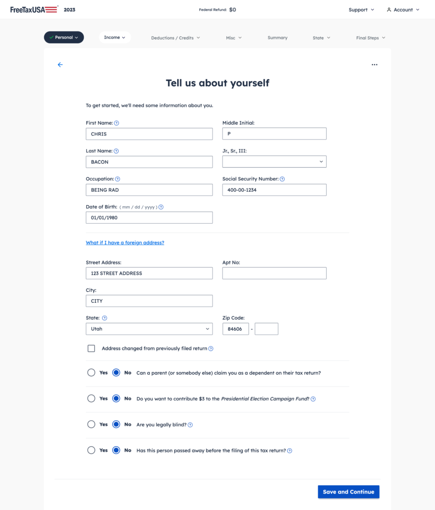
The tax application, initially built ad hoc by developers and tax specialists, grew into a massive and complex product due to the nature of tax updates. Without a unified design system, decisions were often based on personal preference or short-term ease, leading to inconsistencies and a lack of scalability. Inline coding and the absence of reusable components resulted in a fragmented, outdated interface. Developers were hesitant to implement visual updates, fearing the designs hadn’t accounted for scalability or broader implications. Engineers wanted assurance that changes were deliberate, well-documented, and systematic—not arbitrary decisions that would require rework later. Meanwhile, the lack of reusable Figma components and clear documentation on existing patterns slowed design turnaround times, and even when implemented, the final product often failed to align with the designs.
Initiating
After three months of designing without a system, it was clear something had to change. Designers were building mockups from scratch or using screenshots, and decisions were often made on the fly without full understanding of long-term implications. With no documentation of existing patterns, the Lead Designer was constantly fielding repetitive questions.
I took the initiative to research the value and process of building a design system. I then proposed a plan to my manager, outlining how I could dedicate my time to the project and deliver it efficiently.
Role
Lead, UX, UI, writing, IA
Tools
Figma, ZeroHeight
Timeline
July 2023 – Present
Research
I began by auditing existing patterns and components across FreeTaxUSA to identify inconsistencies and redundancies, establishing a baseline for consolidation and rule definition. Drawing on publicly available design systems from companies like Atlassian, Apple, and IBM, I studied common patterns and atomic design principles from Brad Frost to inform the process. To understand why previous design system efforts had failed, I gathered insights from coworkers and solicited feedback from other departments to better grasp their expectations and needs. I also explored various UI kits and component libraries to find potential starting points for our own system.

Requirements
After talking to coworkers from various departments I identified the following needs:
Designers
Place to store and communicate design standards. Simpler way to teach all team members (especially new ones) about our established patterns. Components that are well built so they are easy to update everywhere. Components that are flexible enough to account for all needs but rigid enough to not break rules (especially when used by new or non-designers). Templates that account for main types of pages in the app and allow for rapid prototyping.
Developers
Clearly defined components that are coded cleanly and can be reused throughout the app. Code snippets that are easy to copy. One place to update code. Trust that designers will follow the process and be thoughtful about changes they make. Shared language with designers and others so there’s less back-and-forth.
Product Development Specialists (tax experts who outline code)
Knowledge of what components are available and best practices/usage. Writing guide that serves as source of truth for writing patterns and rules (i.e. OK or okay, use of Oxford comma, etc.)
*determined that writing guide was outside the scope of this project
Marketing
*determined that marketing design system would be created separately with some shared components
Design
I chose Untitled UI as a starting point because it offered a comprehensive framework with assets, components, and templates that adhered to Figma best practices. By reverse-engineering their components, I gained a deeper understanding of Figma’s powerful tools. Although the final elements would differ visually, the design kit provided invaluable insights into creating nested components using component properties, variants, and auto layout. This process not only deepened my Figma expertise but also established me as the go-to Figma resource for the design team.
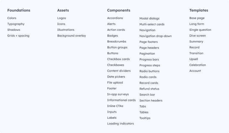
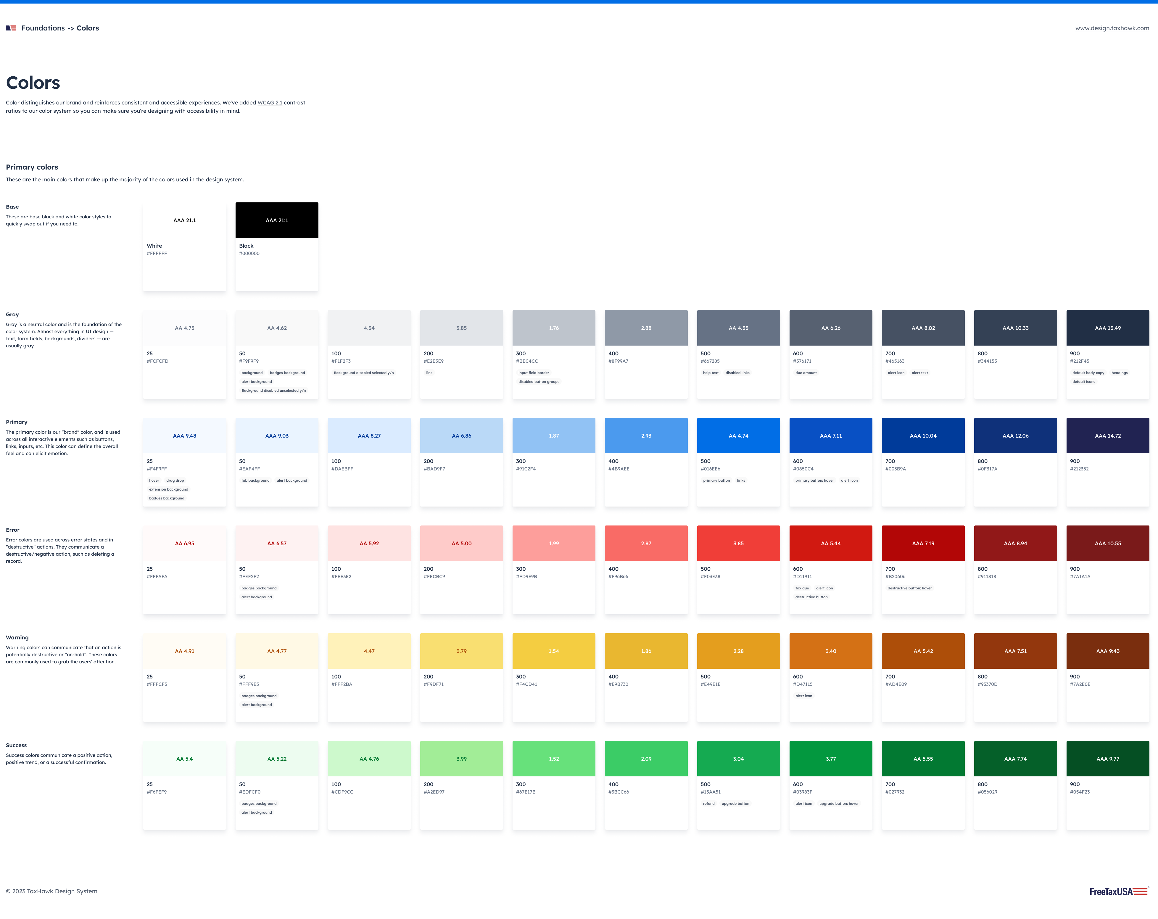
I nailed down our foundations (including colors, typography, shadows, and spacing), adapted components to match our brand and functionality, identified and built missing components, added documentation explaining usage, and built larger page templates made up of smaller, reusable parts.


More research
I watched other designers use the design system to create prototypes. I saw where they got stuck and noticed things like looking for component properties in the wrong place, needing to break components to get them to work how they wanted them to, or using different terms to search for certain elements. I continued to refine Swoop to match this team’s needs and existing mental models.
Handoff
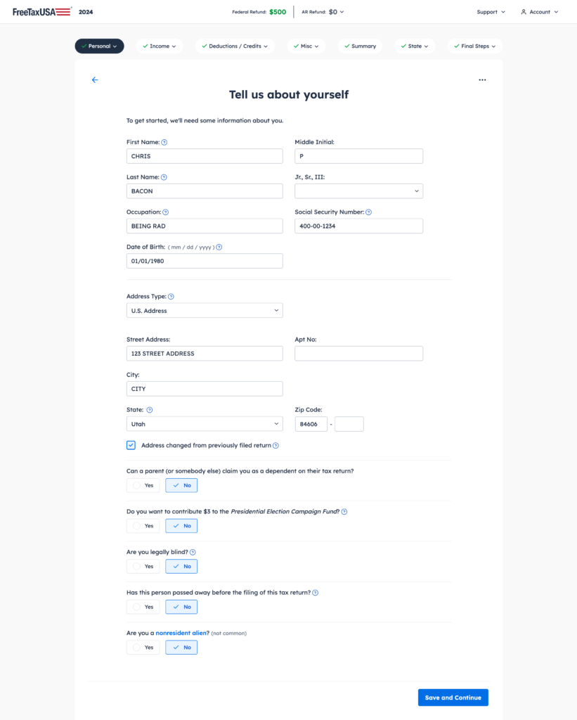
Together with fellow designers Colton Bragg and Jordan Dolinar, I collaborated closely with our front-end in-app developer, Craig Boren, and project manager, Cheyenne Peterson, to implement our foundations and components in code. We rigorously tested component instances to ensure they aligned with our designs and met accessibility standards, including screen reader compatibility. While Craig is still finalizing the coding, many updates are already live in the 2024 taxes web app, where they’ve received positive feedback from customers.
While our primary focus was to organize and clarify our design assets and establish a shared language, a valuable side benefit was improving the overall look and feel of our website through subtle updates.


Results
The impact has been transformative. Designers who once spent weeks on mockups now ideate, test, and iterate within hours. With a shared design language, our teams collaborate more effectively and build with scalability in mind. Reusable design tokens and components enable faster visual updates, helping us stay modern while continuing to improve our UI. Most importantly, our team is trusted, with clear processes that integrate us seamlessly into the company’s workflows.
Next steps
I will continue collaborating with our front-end developer to refine our components and custom tags in code, ensuring design and development remain in sync. Additionally, I’m expanding the documentation to address questions from non-designers, such as helping PDS (tax experts who outline code) decide when to use a standard radio button versus a larger radio card, or when to choose a tertiary button over a secondary one.
The true measure of Swoop’s success will be its adoption across the company. At the heart of the original problem was a lack of a shared language, so beyond beautifying the UI or streamlining the prototyping process, I hope we continue to see that Swoop has established a clear and consistent design language—one that can be easily understood by everyone at TaxHawk and leveraged to drive innovation.
Once the documentation is complete and widely accessible, I plan to host workshops to onboard teams to Swoop, interview coworkers to uncover its effectiveness and any friction points, and gather feedback through surveys to assess adoption and impact. Like any design system, Swoop will evolve alongside TaxHawk’s needs, design trends, and emerging tools—ensuring it remains relevant and impactful as we grow.
Thanks to Craig Boren (dev), Cheyenne Peterson (PM), Colton Bragg (designer), and Jordan Dolinar (designer) for their contributions to this project.
