Taxes for college expenses
FREETAXUSA
FreeTaxUSA wanted to improve the usability of its college expenses process in its tax-filing website. Through user interviews, data analysis, and lots of design iterations, I redesigned the process with feasible changes that made a big impact.
Client
TaxHawk is the parent company of FreeTaxUSA, one of the biggest tax-filing websites in the U.S. Though FreeTaxUSA is known as the “value choice” on the market, it strives to make tax-filing as painless and delightful as possible.
Problem
Although not all tax filers incur college expenses, a significant number do. TaxHawk’s support center identified the 1098-T section as a frequent source of complaints, leading to increased support inquiries and negatively impacting the overall tax filing experience. Usability testing further revealed that many students struggled to understand the questions in this section, often resulting in errors on their tax returns, missed refunds, or feelings of uncertainty and frustration about the accuracy of their filings.
Users
The 1098-T is frequently filed by students, which means its users tend to be younger and less experienced with taxes compared to the average filer. Unlike returning users who consistently file income expenses (W-2) each year, students and their parents typically only file college expenses for a few years, making them less familiar with the process. As a result, it’s crucial for the 1098-T section to be straightforward and user-friendly, especially for first-time filers.
Role
UX, Research
Tools
Figma, Notion
Timeline
April – August 2021
Constraints
While the 1098-T section could have benefited from a complete overhaul, the backend developers were unable to modify the database at the time. This constraint required me to devise a solution that minimized changes to the backend while still delivering a significant improvement. To achieve this, I focused on refining the wording and reorganizing the information to enhance clarity and intuitiveness. We decided to treat this as “phase 1” of the project, with plans to implement more substantial changes, such as restructuring the entire process, if users continued to struggle.
Additionally, many UI elements, such as button styles and typography, had already been established, so I had to ensure my design adhered to the existing style guide, limiting my flexibility with the UI.
Research
Support issues
Before beginning this project, we consulted with managers in the support center to identify key problem areas on the website. They highlighted the 1098-T flow as one of the most challenging tasks for users, which was contributing to a strain on support staff. This aligned with findings from earlier usability tests, confirming that the 1098-T section required attention. I was tasked with addressing this issue.
Unmoderated usability tests
TaxHawk had previously collected videos of unmoderated usability tests in which students navigated the entire tax filing process. After reviewing the footage, it was evident that the 1098-T process had more friction points than other parts of the app. For instance, several students selected the wrong option due to button placement on mobile (the default response was at the top). After unknowingly clicking the wrong button, users felt trapped in an endless loop. Another pattern that emerged (that was later repeated over and over in my moderated usability tests) was that users typed their own address in a box that asked for the school’s address (*spoiler: the input label was ambiguous). Overall, students appeared frustrated by issues that could have been easily addressed.
Competitive analysis
Next, I conducted a competitive analysis of the college expense screens on TurboTax and H&R Block. While we didn’t want FreeTaxUSA to mirror these platforms, I believed the analysis would help me understand which information was essential for users at this stage of the tax filing process. I discovered that both competitors had omitted some questions that we were asking. Upon further investigation, I found that we could eliminate these questions to streamline the process. I also noted that the other platforms took a more step-by-step approach, guiding users through multiple screens and limiting movement between sections. For FreeTaxUSA, we decided to leverage our strengths of simplicity and user empowerment, rather than overwhelming users with extra screens and rigid flows.
Usability test, prototype, usability test, prototype again
I started by testing our current website with two users (both college students), but quickly found that there was a lot of low-hanging fruit that needed to be addressed. I mocked up the things I knew needed to be changed so that rather than having the same few, glaringly obvious problems come up, I could uncover less obvious friction points in my user interviews.
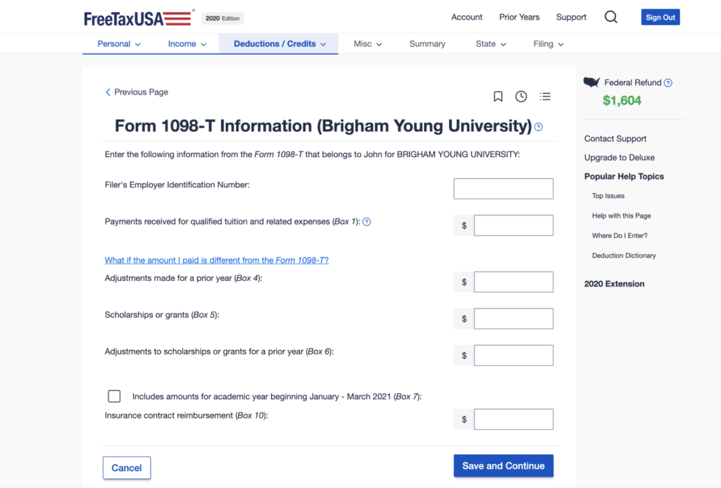
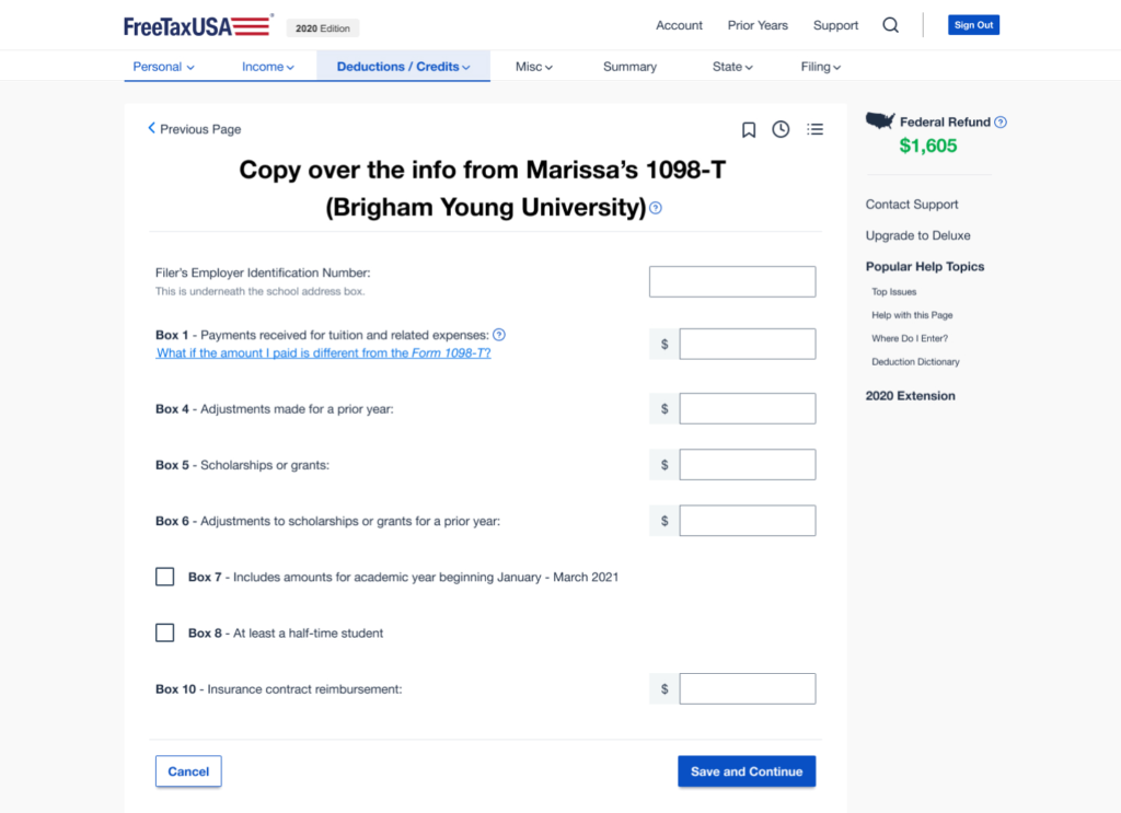
For example, the “meat” of this section is the page where students copy over information from their 1098-T form. Hypothetically, this could be the easiest page in the section because it requires only copying information over from a form—but the current design did not make that clear. By simply changing the title, reducing unnecessary text, and emphasizing the location of the information (such as bolding the box numbers), I made this task much easier for users to complete.
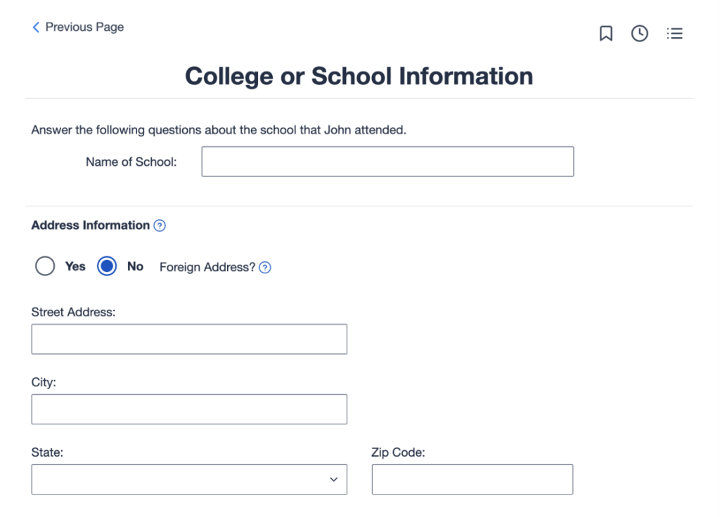
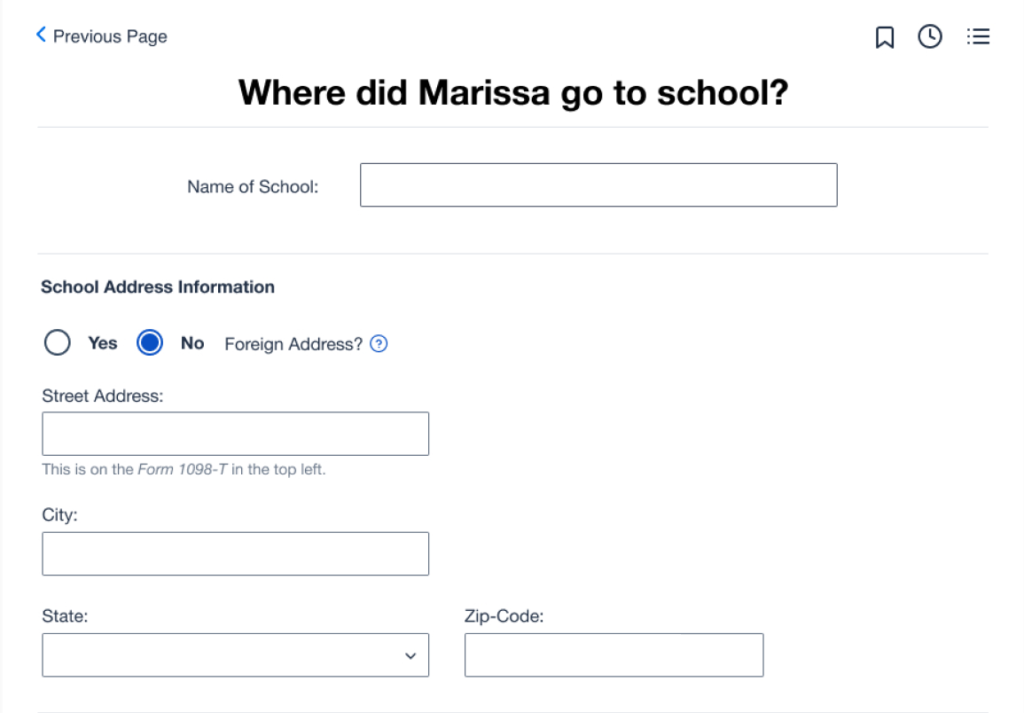
As mentioned, previous tests had uncovered that many users surprisingly struggled with a page that asked for their school’s address. Because of the ambiguous heading, some students entered their own address. Others spent several minutes trying to figure out the school’s address online without realizing that it was listed right there on their 1098-T form. So I updated the heading to specify “school” and added help text letting them know that it was on the form. This greatly reduced the amount of time people spent on this screen in my tests.
After making minor adjustments to the current process, I continued testing the prototype and refining it as patterns emerged. Through nine usability tests with students and recent graduates, I identified the following recurring issues:
1. Students often make mistakes when entering their college expenses, mainly due to confusing wording.
2. Some students abandon questions, leading them to miss potential refunds.
3. Afterward, many students feel uncertain and doubt whether they completed the process correctly, even when they did.
These issues were driven by several specific friction points:
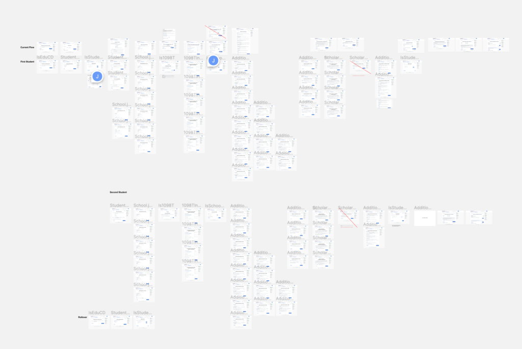
Confusing structure/flow — The architecture of this section is complex because one account can have multiple students, a student can attend multiple schools, and a school can have multiple 1098-T forms. As students navigate deeper into the process, they often feel lost. The support center reported that this is the most common complaint they receive.
Overloading users with responsibility — Throughout this section, we subtly suggest that users need to understand taxes and know exactly what to do, which is not the case. For example, phrases like “you may need to report that amount as income” should be more definitive, such as “this amount will be reported as income.” Our tone lacked assertiveness, which led users to feel uncertain about trusting us as the tax experts.
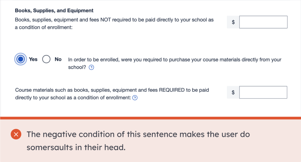
Confusing double negatives and tax jargon—For example, questions like “Do you have any tuition paid that was NOT reported to you on a Form 1098-T?” and “Books, supplies, equipment and fees NOT required to be paid directly to your school as a condition of enrollment” were interpreted differently by several people that I user tested. In real life, this could have had serious consequences.
Solution
After exploring different user flows, I found that users were less confused by the overall structure when they first selected all the students and then saw the information for each one clearly laid out. This approach helped eliminate confusion when the process appeared to restart. To implement this, I changed the screen from “Which student do you want to work on first?” to one that prompted users to “Select all students.” Afterward, a new screen displayed their progress with each student. This change not only provided users with clearer context, but also gave them a sense of accomplishment as they completed one student’s information and moved on to the next.

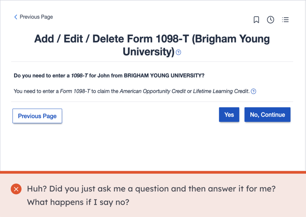
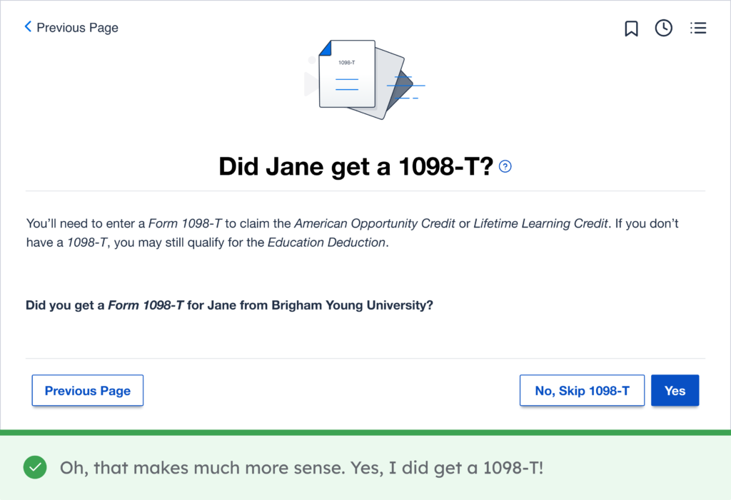
I rewrote several screens to make them clearer and more assertive. In the example below, I aimed to simplify a question that could otherwise confuse users. Since most students receive a 1098-T and are required to enter it if they have one, the question was streamlined to “Do you have a 1098-T?” making it much easier to answer. To encourage users to select “yes,” I positioned the “yes” button in the primary location and styled the “no” button as secondary.
Based on my research, I knew that students valued feeling independent and informed, rather than just following instructions. So, I used this screen to briefly explain the implications of answering yes or no. In testing, users who wanted to better understand their taxes, rather than simply have the program handle it, appreciated this added context.
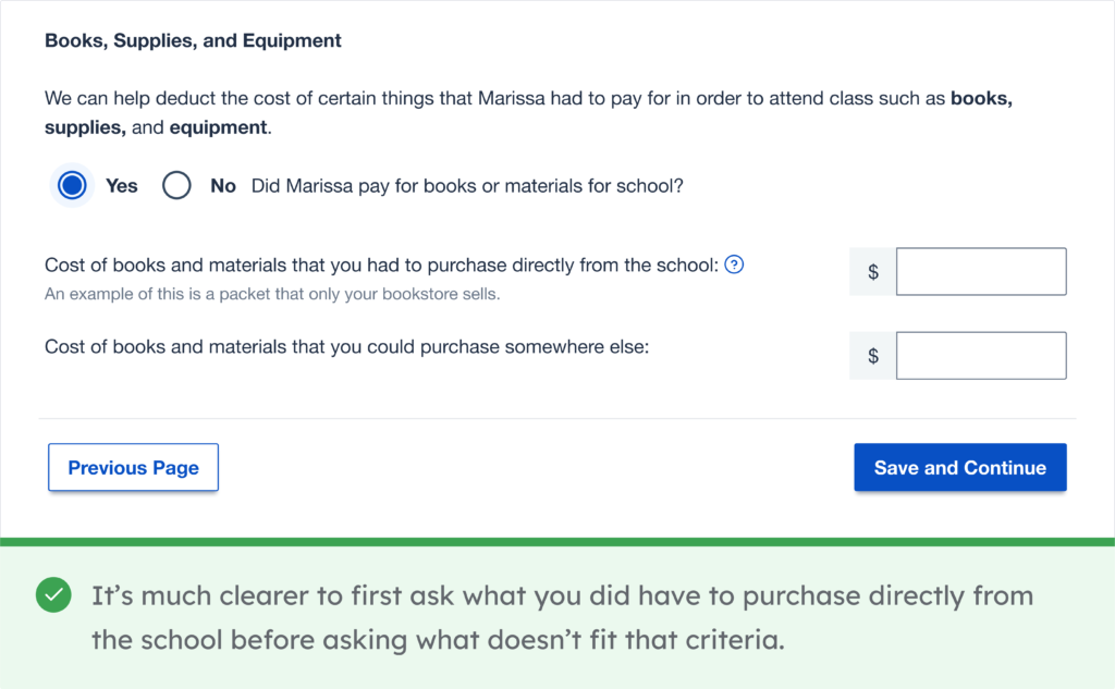
One screen that gave users a lot of trouble and that necessitated several iterations was a screen that asks for the cost of materials like books and school supplies. The most effective design involved hiding the questions and simply asking the user if they had to pay for books or materials for school. After answering this easy, bite-sized question, the two more specific questions would appear.
Because two different tax credits have distinct requirements for eligible expenses, we had to find out both their total expenses and the amount they had to spend directly at the school (for example, it wouldn’t count a book that they could have ordered from Amazon or Chegg, even if they ended up getting it from the school). It’s a confusing concept, but I found that structuring the two follow-up questions in parallel helped users understand it more consistently.
Initially, I used the phrase “Cost of books and materials that you were required to purchase directly from the school” but found that using the word “required” (especially when bolded) led users to interpret it as referring to required reading (as opposed to optional textbooks). I also tried bolding the words “school” and “somewhere else”, but found that users skimmed only those words and then immediately separated out the costs from the school (regardless of whether or not they could have purchased it somewhere else). From testing, I found that not bolding anything in these two questions influenced users to read the whole sentence, which resulted in much better understanding of the requirements.
Conclusion
After finalizing a design that was free of friction points in usability testing, I created a document outlining the changes for each page to ensure a smooth handoff. The design team collaborated closely with tax specialists to define the necessary code changes, and the updates were successfully implemented in 2023, with positive results that we are still measuring.
Lessons
This project reinforced the importance of an iterative design process. By continuously refining the design in response to issues discovered during usability testing, I was able to make incremental improvements that ultimately resulted in a much more effective solution.
Additionally, this project deepened my appreciation for high-fidelity prototypes. Testing with a more polished prototype allowed me to evaluate the design in a realistic context and directly compare its usability to that of the current website, providing valuable insights for further improvements.
